“I like my company’s brand, but I’m in doubt, is it really looking good?” If this question has crossed your mind, you’re not alone. Since we work with brands every day, we hear this often. And, honestly, our usual answer is: it depends. That’s because looking at a brand and trying to quickly define whether it’s good or not might seem simple, but it’s actually a shallow and superficial analysis. Your company’s visual identity needs to be viewed in the right context, with attention, depth, and listening.


“The trademark, although a most important element, can never tell the whole story. At best it conveys one or two notions or aspects of the business. The identity has to be supported by a visual language.”
Steff Geissbuhler
More than just looking nice, more than just “cool”, the brand needs to be coherent with who your company is. It needs to align with the values, the mission, and the way you do things. But how do you know if that’s happening? How can you evaluate if your company’s visual identity is truly aligned with all of that? If you’ve just received a new visual identity or are rethinking your current one, this article can help you see with more clarity the points that need attention.
1 – Is There a Brand Strategy?
A common idea is that the brand is the final touch, the cherry on top. Something that comes after everything is ready, just to make it look nice. But, when the visual identity of your company is placed in that decorative role, the evaluation turns into a matter of personal taste. And taste, as we know, varies from person to person. A strong brand doesn’t come from what looks nice to someone’s eyes, but from a strategy that comes from within, connected to what your company does, believes, and offers. So, the first step to understand if your brand is looking good is to ask: does your company have a brand strategy? In our view, this is an essential tool in branding, helping to translate the business plan into more accessible language. It organizes the company’s plans into key topics, like purpose, differentiators, and promises, creating a clear path to align the visual identity with the essence of your brand.
For example, Tartiner makes artisanal spreads with top-quality ingredients. Over time, they realized that their old labels no longer reflected the company’s vision. The new identity was born from a clear strategy: to be a brand connected with the clean label movement. From that, we created packaging with icons and illustrations of the ingredients, bringing out the affection and care of the “little jars of happiness.” A visual expression that resonates much better with who Tartiner is today.
+ Also Read – Brand Strategy: What It Is and Why Your Business Needs One

The new labels for Tartiner reflect the brand’s current moment and everything it wants to convey now. Photo: Amanda Nunes. See the full project.
2 – Who is the Brand Communicating With?
A visual identity only fulfills its role when it manages to connect with the people on the other side. And for that to happen, it’s essential that your company knows clearly who it is trying to talk to. When this answer is vague, the communication also becomes unclear, and the brand loses strength. So, the question is: does your company have clarity on who it wants to reach and delight? It’s very common for small and medium-sized businesses to answer this question generically, saying that they serve “people of all ages” or “anyone interested in what we do.” But, deep down, these answers don’t say much about who is really on the other side. Understanding who that person is involves listening, exchanging, and observing carefully. It means moving away from what we think we know and heading toward what is actually true.
For example, Lúcida Letra (which translates literally to ‘Lucid Letter‘) came to us with this question: was the brand making sense for those following the publisher? We suggested conducting research with the people closest to the company, those who already had a relationship with it. The results were revealing: for example, the symbol was not understood by many of the readers. Based on these discoveries, we defined, together, what the brand strategy was, which gave rise to the Beloved Brand of Lúcida Letra, a visual identity that was more aligned, sensitive, and true to the company’s audience. This project was even a finalist in the Rebranding – existing brand revitalization category at the 9th edition of LADAWARDS, Latin America’s biggest design award.
+ Also read – How Is a Brand Strategy Born? Our Step-by-Step Methodology
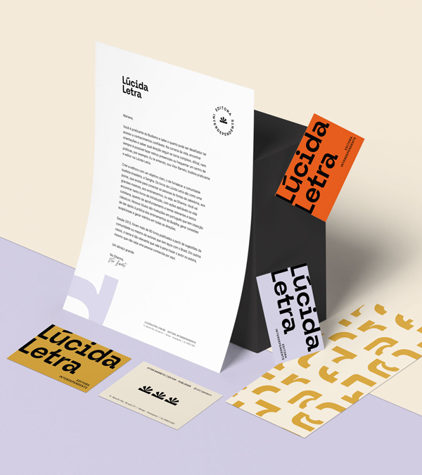
Lúcida Letra listened to its readers and customers to understand if the brand still made sense, and that made all the difference. The new visual identity was also recognized as a finalist at the LADAWARDS, in the Rebranding category. See the full project.
3 – Does Your Company’s Visual Identity Stand Out?
One of the most effective ways to understand if your company’s brand is on the right track is to observe what’s going on around you. When the visual identity looks too similar to other companies in the same industry, there’s a risk of being confused, overlooked, or even appearing generic. That’s why it’s worth investigating: who are your company’s direct competitors? What does their visual identity look like? Are there symbols, colors, or styles that are too similar to what your company is using? The more repeated these elements are, the harder it will be for your brand to stand out. This comparison isn’t about copying or competing, but about understanding the visual space your company occupies in the market. By finding that unique space, communication becomes clearer, lighter, and more memorable. Observing your surroundings can be a great starting point.
This was exactly the reflection that Mapa, a Peruvian exchange agency, decided to undertake. Until then, its visual identity used very common elements in the sector, like airplanes and map pins, accompanied by sober shades of blue. When it was time to rethink everything, we created, together, a more lively and personalized visual language, where each letter of the name turned into a Mapa (map), and the destinations gained brushstroke shapes, symbolizing the beginning of a new journey. The result was a visually unique brand that truly stands out from the rest
+ Also read – Is It the right Time to Invest in My Brand design?

Mapa’s visual identity carries plenty of personality and helps the company stand out in the exchange programs market. See the full project.
4 – Does Your Company’s Brand Have a Visual Repertoire?
Many people believe that visual identity is just the logo. But vibrant, present brands go far beyond that: they need a consistent and creative visual repertoire. Colors, typography, graphics, icons, illustrations, mascots, patterns, and more. You don’t need to have everything, but it’s important to have enough to create a coherent and expressive communication.
It’s worth paying attention to the materials your company is already using: social media, website, packaging, signage. Do they feature a variety of resources to express the brand’s identity? Or does everything revolve around the repeated logo? When the repertoire is limited, the communication can feel monotonous or confusing. But with a well-structured visual system, it gains lightness, flexibility, and unity. If this set hasn’t been established yet, it may be time to expand for more professionalism, fluidity, and clarity in the touchpoints with your audience.
That’s what happened with Amuri, for example. They work with financial education and had already been communicating with visual elements taken from the covers of the two books they wrote, materials that were quite successful. However, despite being familiar, these elements hadn’t been thought of as a brand repertoire. In creating the new identity, we rethought everything from the essence of the business. We developed a unique visual system with colors, graphics, and shapes aligned with the Beloved Brand personality Amuri wanted to express. The result was much more coherent, light, and authentic communication and a repertoire ready to be used freely across the various touchpoints with the audience.

A new visual repertoire that translates the personality of Amuri with lightness and facilitates communication in everyday interactions. See the full project.
5 – Does Your Company’s Visual Identity Work Well?
A beautiful brand on paper doesn’t always work well in the real world. Sometimes, the visual looks interesting at first glance, but when it comes to using it, difficulties arise. That’s why it’s worth taking a moment to observe: does your company’s brand work well at different sizes? Is it legible when displayed in small formats, like a business card or social media icon? And when applied over dark or colorful backgrounds, is it still visible? These subtle details can give the impression of carelessness and can harm the perception of your company. A well-thought-out visual identity needs to work clearly and easily across different formats and situations. And ideally, it should come with usage guidelines to maintain consistency over time. If the application of your brand still raises doubts or obstacles, it might be time to address it with more care.
That’s what happened with Bangalô Ilhabela, a charming retreat located on the beautiful island of Ilhabela in Brazil, offering unique and cozy bungalow accommodations. When they came to us to redesign their visual identity, we noticed that the previous brand was being used in formats that didn’t ensure good quality. This was because the original files weren’t available in professional versions, like vectors. This is a very common problem that ultimately hurts the company’s perceived quality. In the new Beloved Brand project for Bangalô Ilhabela, we made sure to deliver all the necessary files, along with clear usage guidelines, to ensure that the new visual identity worked well across all touchpoints.


After the Beloved Brand project, Bangalô Ilhabela now has everything they need to use their brand with confidence and security. See the full project.
Conclusion: Is My Brand in Good Shape?
Determining whether your company’s visual identity is on the right track involves more than just assessing if it’s beautiful or modern. What truly matters is understanding whether it accurately represents who your business is, what it offers, and how you want to connect with people. Starting with your brand strategy is essential. It organizes ideas, translates your business plan into a more accessible language, and helps build a visual path that makes sense. From there, it’s important to pay close attention to who your company wants to enchant, listen to these people, and understand how they perceive the brand today.
It’s also crucial to observe the surrounding landscape: what are other companies in your industry doing? Does your brand stand out clearly? And don’t forget something fundamental: your company’s visual identity isn’t just the logo. It lives in the details: the colors, the fonts, the graphics, and every touchpoint with your audience. And, of course, all of this needs to be technically prepared to work well in all formats, with quality.
These are just a few of the key questions we consider when someone asks us, “Is my business’s brand looking good?” We hope these reflections help you better assess your company’s visual identity. Have any questions? Leave a comment, and we’d love to chat! Does your business want to captivate? Request a Beloved Brand proposal and let’s talk!