BELOVED BRAND | TARTINER
Artisanal spreads made with nothing but the essentials in each “little jar of happiness.”
A delicious rainbow of flavors.
SERVICES: REDESIGN, VISUAL IDENTITY, STRATEGY & PACKAGING
LOCATION: RIO DE JANEIRO, BRAZIL | Year: 2024
Awards: Shortlisted for the 25th ABRE Brazilian Packaging Award.
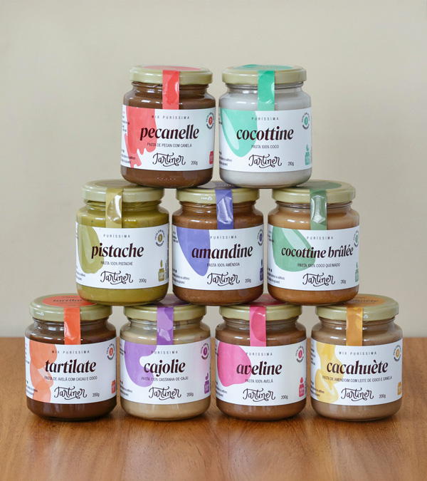


Tartiner is an established brand in the Brazilian market that creates artisanal spreads using only the essentials in each “little jar of happiness”: just almonds, only hazelnuts, pure pistachios, and so on. The packaging redesign marks the brand’s most mature phase. The main challenge was maintaining the clean label concept with a minimalist design that highlights the purity of the spreads. It was also important to make it clear that each jar contains only a few high-quality ingredients.
The creative concept behind the new packaging family focuses on the purity of the ingredients. The labels use the silhouette of each ingredient as the main visual element. Vibrant colors, inspired by a rainbow of flavors, reveal the delicious content of each jar. To reinforce the idea of purity, the labels feature a “made with only 1 ingredient” stamp and a phrase like “This jar contains: Pistachio and nothing else!” according to the flavor. A small illustration of the jar along with the silhouette of the main ingredient reiterates the use of pure ingredients, aligning the brand with the clean label movement. These are some of the feelings that bring Tartiner to life, the Beloved Brand of this artisanal spreads, created to highlight purity and simplicity in every jar of happiness.


“We really liked the visual proposal. It looks premium, elegant, and aligned with the image we want to convey. Congratulations on the work! It’s beautiful!”
Joana Calmon
OWNER OF TARTINER


The Puríssima and Mix Puríssima lines contain 1 to 3 ingredients and are unsweetened. But the Tartiner family also includes the Sweetened with Date line. To differentiate it without losing visual identity, the label background was given a dark color, symbolizing the date that sweetens every flavor naturally. The ingredient silhouettes remain the visual focus, with bold, contrasting colors.


Date Honey is also part of the family and is the only product with a yellow background. This color evokes honey, and the date shapes on the side in three colors draw attention. Completing the family, the With Collagen line features flavors that also use pure, high-quality ingredients. For this line, a dark beige background creates visual unity and again pairs with the silhouettes of its key flavors.


The Provinhas Kit is a box with six irresistible mini jars featuring the most beloved products, ideal for tasting or gifting. The product line has expanded beyond spreads and now includes peanut confections and granolas. The challenge was to use the same visual language, icons, and details in very different formats while maintaining consistency.


FOOD STYLING PHOTOS: Mariana Werner | photos: Amanda Nunes