“Blue is my favorite color!” That sentence is so common, it feels automatic. Since childhood, we’re asked, “What’s your favorite color?” as if we could really pick just one. And when it comes time to create the company’s visual identity, this thought comes to the surface. Colors have multiple meanings and are also often connected to feelings in each person’s memory. But when it comes to our company’s communication, does it make sense to choose the color we like the most?


“Color is a power which directly influences the soul.”
Wassily Kandinsky
After so many years of watching brands be born and transform, we’ve learned that choosing colors is much more complex than it seems. After all, they need to convey what the company is and create identification with the people it wants to reach. This context matters a lot because the colors of the visual identity need to make sense for the business and, above all, for those who will connect with it. The selection process should start from that point.
1 – Stereotypes vs. Context
“Yellow makes you hungry”. “Blue is calming”. We bet you’ve heard something like that before. And yes, colors do stir up emotions. But do those meanings stay the same for everyone, everywhere? Not really. Across different cultures, the same color can be interpreted in many ways. Red, for example, can symbolize passion in some places, good fortune or prosperity in others, and even danger. It all depends on context: cultural and personal. It depends on the experiences of the person seeing it. And when we’re talking about branding, the meaning can shift again. Because a visual identity has a power: the power to create its own universe, with symbols and meanings that resonate within the unique context of your brand. That’s why the first step in choosing colors for your visual identity is to pause the “universal rules”. Instead of asking, “What does yellow mean?”, a better question to ask together might be: “What could this color mean here, within my brand?”
That’s exactly the path we took with Tartiner. For the packaging project, we chose colors that were anything but obvious, like purple for the cashew spread and pink for the hazelnut. None of these ingredients are naturally those colors, yet the choices worked beautifully. Because they represented the idea of a rainbow of unique flavors, crafted with care and tenderness. Some colors followed expectations, like green for pistachio, while others didn’t. For the cashew spread, we wanted to contrast with its light beige tone, and purple brought that highlight in a gentle way. For the hazelnut, we began with the reddish-brown color of the shell, which eventually led us to pink. Each color choice was guided by Tartiner’s brand universe, not by the colors of the ingredients themselves.
When a visual identity is built with a methodical approach, colors gain new meanings and create a genuine connection with those who see them. This care was also recognized by experienced design professionals: the project was shortlisted for the ABRE Award of Brazilian Packaging, in the Graphic Design category for sweet foods, and also for the 15th BDA – Brazilian Design Award, in the Packaging Design category, showing that a thoughtfully crafted project can stand out even in front of demanding juries and expert professionals.
+ Also read – How Does a Visual Identity Come to Life? Our Step-by-Step Methodology


Tartiner’s packaging forms a rainbow of flavors, and the project was recognized by the juries of the ABRE Award and the BDA. Photo: Amanda Nunes. See the full project.
2 – A World in Every Color
“The brand’s identity color is going to be green!” It’s common to hear phrases like this when we start thinking about a brand’s visual. And often, the chosen shade has to do with the favorite color of someone involved in the project. But does simply saying “green,” for example, really explain which green it is? Remember that the color green holds a world of possibilities within it. You might think of a green like a leaf lit by the sun, or a moss green. There’s the green of the sea and the green of a swimming pool. Or do those shades lean more toward blue? In the end, you could spend hours thinking about shades and types of colors and even referring to them by evoking different feelings and situations. That’s why, more than choosing a color you like, what your brand needs is to find the shades that best represent the feelings it wants to convey.
In our creation process, we don’t just pick a color by pointing to a square on a chart. We listen to your brand’s story, test possibilities, combine paths, and ask questions like: What if this tone were deeper? What if it were lighter? What if we added a bluish touch or made it earthier? The universe of color is full of subtle nuances, and paying attention to them can transform how your brand shows up to connect with people.
3 – Is the Neighbor’s Grass Greener?
When it comes to choosing your brand’s color palette, the focus should definitely be on your brand’s unique universe. But it’s also worth taking a look around. Is the neighbor’s grass greener? Or better yet: is it the same shade as yours? Observing direct competitors, and even market leaders, can help you notice which colors are already overused and which ones are still open for exploration. This can prevent your brand from blending and create room for something more genuine and distinctive. Some industries rely so heavily on certain colors that they become almost like a uniform. Think about luxury, weddings, or jewelry, and the iconic Tiffany blue probably comes to mind. That shade is so recognizable, the brand even registered it and others in the same sector can’t use it. Here’s a question worth asking: Are your brand colors truly expressing what makes your business special? Or are they unintentionally repeating what everyone else is doing?
In our Beloved Brand project for the Australian sensory toy company SensaConnect, standing out was key. Direct competitors used tones often associated with the children’s universe, such as blue, red, and yellow, creating a visual pattern that felt overdone. For SensaConnect, we wanted something that would catch children’s attention, but avoid the obvious. The palette we chose blends soft pink, orange, navy blue, and white, a combination that creates a playful and distinct visual world. It resonates with the brand’s audience and reinforces what sets it apart.
+ Also read: Is my brand looking good? How to evaluate your company’s visual identity
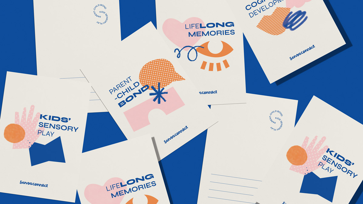
The SensaConnect color palette plays along with the brand’s joyful proposal. See the full project.
4 – A Color Palette in Harmony
When we think about brand colors, it’s common to imagine just one main color. But in reality, your brand’s identity is born from a set of colors, the well-known color palette. And this palette isn’t just for decoration: it’s the foundation for creating unity in everything your brand communicates, from your logo to your social media, from packaging to print materials. Each color plays a role. Some take the spotlight, while others offer gentle support. And that balance can shift depending on where the colors are used. A poster might feature a single bold color, while a social media post may bring two or three together. The magic lies in finding harmony and consistency, even when the colors appear separately. A well-crafted palette helps your brand become more memorable, recognizable, and most importantly, build deeper connections with the right people. And here’s something extra beautiful: when built with intention, even the names of the colors can carry meaning.
Take the visual identity we created for Le Petit Chéri Artisanal Bakery (which means ‘Little Darling’ in French) for example. Each color was given a name that speaks the brand’s language. Instead of “light gray” or “medium orange”, we used names like “organic flour”, “crispy crust”, and “golden shell”, a way of translating the flavor and care found in every artisanal loaf the brand makes. The soft, delicate “Chéri green” echoes the gentle pace of slow fermentation. This palette works in harmony with all the other elements of the Le Petit Chéri brand, its logo, illustrations, icons, patterns, and photography. Everything embraces everything else, and together, they tell one cohesive story.
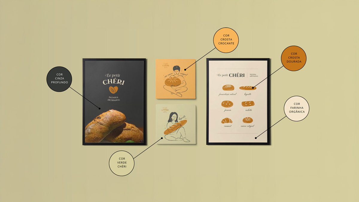
On Le Petit Chéri’s posters, the colors appear in different proportions, but always with the brand’s warm, artisanal feel. See the full project.
5 – How to Keep Your Colors Consistent
Once you’ve lovingly chosen the colors of your visual identity, there’s an essential next step: making sure they show up the right way, no matter where they’re used. That goes for both the digital world and the physical one. After all, no one wants to see a beautiful color on the website look completely different when printed on a flyer. Your brand’s visual identity works like a recipe. To get consistent results every time, you need to use the same ingredients in the right proportions. In this case, those ingredients are the technical color codes: RGB for screens, CMYK for print, HEX for digital environments, and whenever possible, Pantone®, which offers even more precision and unique shades like metallics or neon. These codes make it possible for anyone, anywhere in the world, to recreate your brand’s “recipe” just right. A color chosen in Brazil, for example, can be printed exactly the same way in Japan, as long as you use the same Pantone® reference.
In our Beloved Brand project for Colarinho da Serra, each beer flavor was given its own unique color, designed to reflect the lightness and freshness of the ‘Serra dos Órgãos’, a beautiful mountain range in the city where the brand was born. Keeping this palette consistent, from the bottle to the bar menu, helps convey the Colarinho da Serra’s spirit of freedom and relaxation. That’s why it’s so important to keep all your color codes organized and easy to access. Taking care of this technical side ensures that the beauty and intention behind your brand stay intact, whether it’s on a phone screen or in the hands of someone holding your product.
+ Also read: Pantone Colors: what they mean and how they can help your brand

Each color expresses a beer flavor, without losing the visual unity that ties everything together in the Colarinho da Serra identity. See the full project.
Conclusion: So, who’s going to light the way now?
In a world full of possibilities, who can help you choose the colors for your brand? Green Lantern, perhaps? After all, his name says it all: green! But the good news is, you don’t need to rely on luck (or superheroes). Joking aside, there’s an entire profession dedicated to studying colors and their combinations. That’s design, our passion and our craft. Designers like us help businesses find the right palette amid so many options. Here, we remain fascinated by this universe and ready to help your business create a beloved visual identity, color by color.
How about you? How has the process of choosing your company’s colors gone? Did the many options make things a bit confusing, or were you always sure about the colors you wanted? Share your colorful stories with us in the comments, we’d love to hear how your brand’s journey looks! Feeling like you need help? Let’s create together, request a proposal!