“I need a brand, and I’m already imagining what the symbol will look like.” Maybe you’ve said or thought something like this before. It’s very common to associate branding with a symbol right away. And when it comes to visual identity, it’s only natural to notice shop signs, the tags on your clothes, or even objects around your home, all in search of something iconic that might spark inspiration. But here’s the question: does every brand really need a symbol?


“Symbols are vessels for meaning. They become more powerful with frequent use and when people understand what they stand for. Meaning is rarely immediate and evolves over time.”
Alina Wheeler
Some of the world’s most famous companies are known for their iconic symbols, like Apple or Starbucks’ siren. But that doesn’t mean every brand needs one. Take Coca-Cola or Avon, for example, both are instantly recognizable around the globe without a symbol in their logos. So how do you know what makes sense for your brand? That’s what we’re here to talk about.
1 – The building blocks of a brand
First things first: a brand usually has three main elements, the logotype, the symbol, and the tagline. The logotype is your business name, drawn in a unique way, designed just for you. The symbol, when there is one, is a graphic sign that can go alongside the name or appear on its own depending on the situation. And the tagline is that short phrase that tells people what you do or highlights what makes your brand special. These elements don’t need to show up all at once. What really matters is that they work in harmony and truly reflect who your business is.
A beautiful example of this is Botané, a deli and café with a warm, soulful approach to food. When we started designing their visual identity, we noticed that the dishes created by chef Josie all followed the same philosophy: freshness, simplicity, and letting the ingredients shine. The Botané brand grew from this essence. The chosen symbol is a heart-shaped root, what lives beneath the soil, nourishing life, and eventually becoming food for both body and soul. It gently carries the story of those who create, nurture, and serve.
+ Also read – 14th Brazilian Design Biennial: Three Projects Selected!
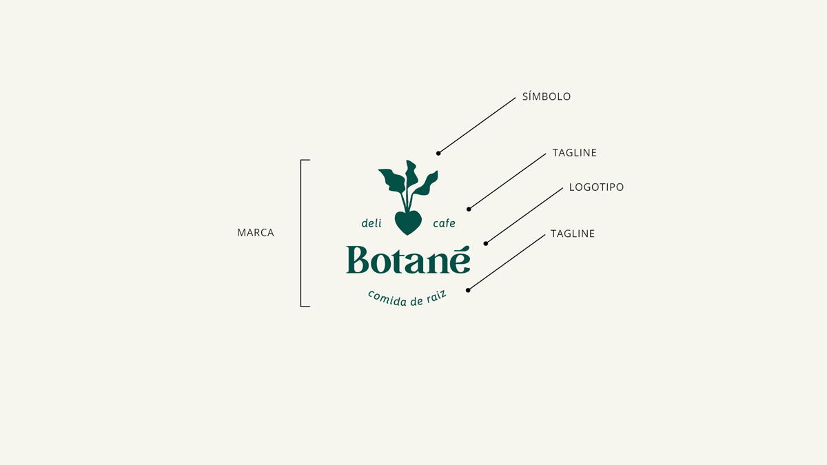
Botané has a symbol, logotype, and taglines, all working together in the exact way the brand needed. See the full project.
2 – Having a Symbol: Freedom or Limitation?
The symbol is a graphic element designed to visually represent a company. It helps create quick recognition and, in some contexts, can even replace the full brand. But the decision to include a symbol in your business’s visual identity depends on your brand strategy and the story your company wants to tell. In our Beloved Brand projects, we always reflect carefully on this choice. Our favorite question at this moment is usually: will including a symbol expand the possibilities of the brand, or could it end up limiting its expression?
Take Opulim, for example. It’s a company that creates children’s parties with themes ranging from the depths of the ocean to space. When they approached us to develop their name and visual identity, we realized that a single symbol might not capture the diversity and richness of the brand’s visual universe. Instead of looking for a fixed icon, we chose to develop a more open visual system, full of elements that can vary. This decision brought more creative freedom and allowed Opulim’s visual identity to come to life in many forms, while still maintaining unity.
+ Also Read – How Does a Visual Identity Come to Life? Our Step-by-Step Methodology

For Opulim, we created a visual system that adapts to the party themes, even without a fixed symbol. See the full project.
In the case of Lúcida Letra (which translates literally to ‘Lucid Letter’), the choice was quite the opposite. The company is a publisher specializing in books about Buddhism, a universe with a very unique and meaningful visual language. The challenge was to find a symbol that represented this world without falling into clichés, while also being unique to the publisher. We began with the idea of “letter”, which is already in the name. That’s when the asterisk came into play. It became our starting point: a character full of possibilities. The shape of the asterisk was adapted into an open book on a table, radiating light, a visual metaphor that resonates with the desires of the publisher’s readers: enlightenment, wisdom, and clarity. This symbol began to represent Lúcida Letra, creating immediate connections with those on this shared journey. It was this path that, with pride, also led the brand to be a finalist in the Rebranding category of the 9th edition of LADAWARDS, an important design award.

The symbol of Lúcida Letra brought lightness and freedom, allowing new ways to communicate with readers, and this project was selected as a finalist for the LADAWARDS. See the full project.
3 – It’s Also About Balance
Another aspect that helps understand whether having a symbol in the brand makes sense is visual balance. Sometimes, the logo itself already has so much presence and personality that adding another graphic element could confuse more than complement. This happens when the letters have distinctive details, different weights, or a style that draws a lot of attention. In such cases, the symbol risks competing with the company’s name, and that’s not what we want. But the opposite can also happen. When the logo has a simpler, lighter visual, the symbol acts as a complement that enriches the identity. What matters is that the overall design works well, with harmony and clarity, so that people can easily recognize the brand and connect with it.
This is what we realized when creating the identity for Piece of Paper, a fine stationery brand that makes impeccable notebooks. The logo was designed with letters full of personality, crafted with care. And the word “of” was hand-lettered by us, adding a more delicate touch. Together with the two taglines, the visual was already complete. Adding a symbol there could have disrupted the lightness and balance of the composition. That’s why Piece of Paper’s Beloved Brand doesn’t have a symbol, and it makes perfect sense this way.
+ Also Read – Pantone Colors in Businesses: What They Are and What They’re For
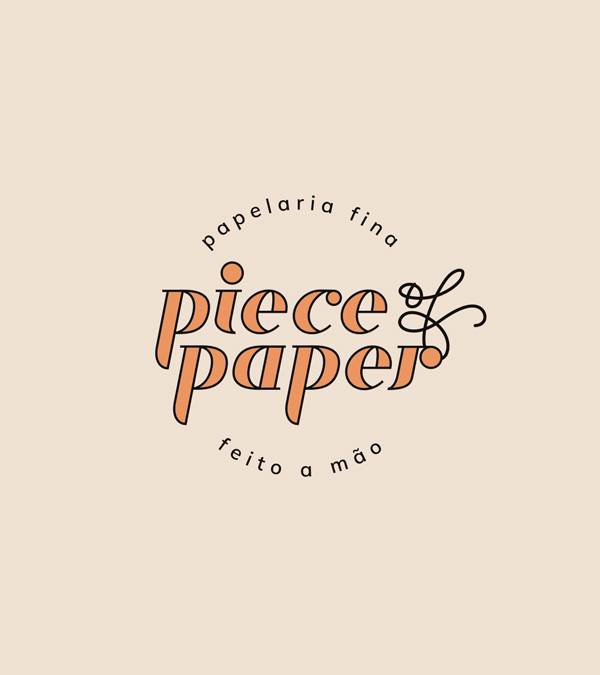
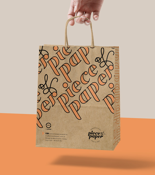
Piece of Paper is a brand without a symbol, but with a logo full of presence and taglines that complete the company’s voice. See the full project.
Another example is the Beloved Brand of the deli and café Botané. From the very beginning, we knew the logo would play an important role in the identity, so we chose a charming typography that well translated the space’s proposal: warm, delicious, and with personality. The brand name already had great clarity and elegance. But in this case, we felt that a symbol could add another layer of meaning. Something that represented the care with the ingredients, the chef Josie’s bond with the earth and roots, and also the feelings behind each dish served. Thus, it complements the logo without competing with it, adding more depth to the overall visual.
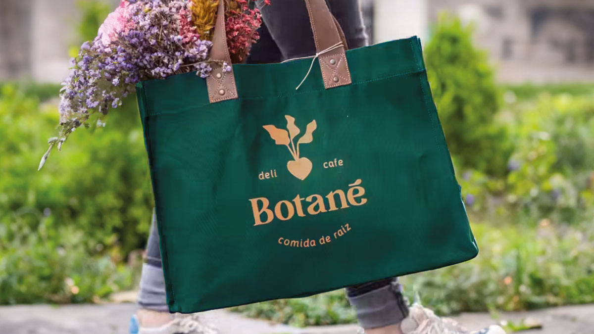
The symbol helped balance the visual identity of Botané, and the brand was even recognized at the Brasil Design Award. See the full project.
4 – The Symbol as Part of a Whole
When we talk about symbols, many people think of the brand. But it’s important to remember that the brand doesn’t need to represent everything your company is on its own. Visual identity goes far beyond a logo, whether it includes a symbol or not. What truly makes the difference is having a complete visual repertoire, made up of elements that connect and tell a story together. Colors, typography, patterns, graphics, illustrations, and others are the elements that help create a more vibrant, interesting communication that reflects the essence of your company. When the whole is well thought out, it conveys personality, values, and purpose much more powerfully than a standalone symbol could.
In the Beloved Brand project for Mapa (which means ‘Map’), a Peruvian company specializing in exchange programes, we started by designing a simplified map with the contours of the countries the company serves. From this, each letter of the logo was created as if it were one of these territories, a poetic way of representing the destinations Mapa offers. These places also gained their own illustrations, creating an identity full of references, meanings, and beauty. It was the whole set, not just the symbol, that brought soul to the communication. That’s why, instead of seeking the “perfect icon”, it’s better to look at the bigger picture and understand what truly makes sense for your company.


Mapa has a complete visual repertoire to communicate with the world, even without a symbol in the brand. See the full project.
5 – Two Steps Back: What Comes Before the Symbol
Before any visual decision, it’s important to take two steps back and pay closer attention to the foundation of everything: your brand strategy. We understand that the symbol may seem like an exciting visual element, perhaps even the most fun part of the process. But it only truly makes sense when it comes from something deeper. It’s essential to clearly understand what makes your company special, what its differentiators are, what it offers that’s most valuable, who you want to reach with your message, and how you want to position your business in the world. Even competitors play a role in this equation, after all, knowing the landscape your company is in helps avoid repetition and ensures your brand’s visual identity is unique and memorable. So, before investing energy in imagining whether or not you’ll have a symbol, our suggestion is: take a deep breath and start with strategy. Once that’s clearly defined, visual choices, including the symbol, become lighter, more conscious, and connected to what your company truly is.
+ Also read – Brand Strategy: What It Is and Why Your Business Needs One
Conclusion: Does Your Brand Need a Symbol?
The symbol is undoubtedly one of the most recognizable elements of a brand. But that doesn’t mean it needs to be present in every project. Sometimes, it offers freedom to create; other times, it can limit the brand’s expression. That’s why the decision to have or not have a symbol should be made carefully, considering the entire set. Striving for balance between visual elements helps a lot in this process. And it’s important to remember that the symbol is only one part of the visual identity, not the whole. Colors, typography, textures, and other graphic elements help tell your company’s story and make the communication richer and more interesting. Above all, it’s essential to have a clear strategy before making visual decisions. When the essence of the brand is well-defined, everything that follows, including the creation of a symbol, gains purpose and coherence.
+ Also Read – How Is a Brand Strategy Born? Our Step-by-Step Methodology
Are you at this stage of thinking about your company’s visual identity? What do you think about the presence of a symbol? If you’d like to chat about it, we’re here, with open hearts. Request a proposal here!